Sie Fate
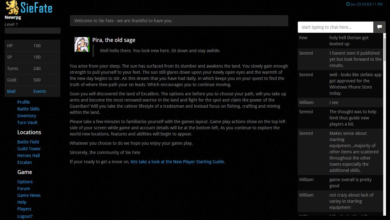
Sie Fate is a text based browser game, including fantasy RPG set in the world. Sie Fate took the traditional out of RPG and instead replaced it with something a bit more special and unique. Sie Fate is all about the right moves and the right setup. Game is mobile friendly and made in 2014. Has a very fresh scent to it. Game has currently four locations available: Battle Field, Guild Tower, Heroes Hall and Escalan.
Choose rating
Sie Fate images
6 comments on “Sie Fate”
I love this game. It's easy to play and highly addictive.
im a true gamer. i found a game that i like much better. enough said on that. you on the other hand know nothing about me. so move on, go play in the sand box and let the cats cover you up. troll that!
nothing much to keep an adult entertained but i think young kids would enjoy it. its easy to play, goblins and such to kill, gold to be found, fish to be had and sold, etc.
it is great!
this game is simply delightful, it needs work but that is simply because it is fairly new play it now
I gave it a try several months ago and had the same conclusion: I don't like it at all.
Wow. Rather horrible game because it offers so little.
Have you ever played "HoboWars"? If yes, then you know the one minor activity "Explore the City". That's the **MAIN** activity in "Sie Fate".
Other problems:
1. Yes, there's a minor activity where you can vote for "Sie Fate" on six different sites. However, the game gives you NO REWARDS for voting unless enough players from the previous day also voted. I have **never** seen such stinginess in any other game.
2. The English in this text-based game is often abysmal. Here's an example:
"If you would like to sell directly to the Market NPC instead of to players. Simply fill out the How many form..."
It's not from lack of education. I really don't know why anyone--even a non-native speaker--would punctuate the above sentences as indicated.
Positive aspects:
1. Ability to change "Layout Theme". Default for new accounts is "Dark", which is too gloomy and obscures some elements of the display such as alternating background colors of Chat. I changed to "Clear".
2. Option "Do not use integrated chat" to remove Chat from right side of screen, thereby providing additional space to the main area of the display.
Conclusion:
Don't waste your time with this game until the developer puts significantly more effort into it. I have a mild headache--seriously--after my initial exposure.
you probably got the headache from complaining too much. just shows how you are out of a game.
Well, roy, have you put significantly more effort into your game yet. or are you too busy defending your pride of (crap) authorship?


Add a comment